Primary Logo & Positioning Statement


Black & White Logos


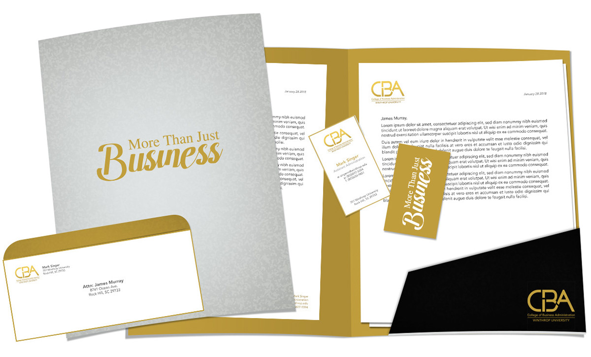
Stationary Suite & Pocket Portfolio
I like contrast in my design, so the "professional but casual" worked perfectly for this project.
I designed the letterhead and business card with a clean white front side, backed up by the second color
on side two in a solid with reverse white type. I carried that forward on the #10 envelope by creating
a "make" with a solid bleed on the back flap.
The portfolio cover is in a tint of the black with a solid full bleed of color on the inside
plus the stark contrast of the black die-cut pocket.
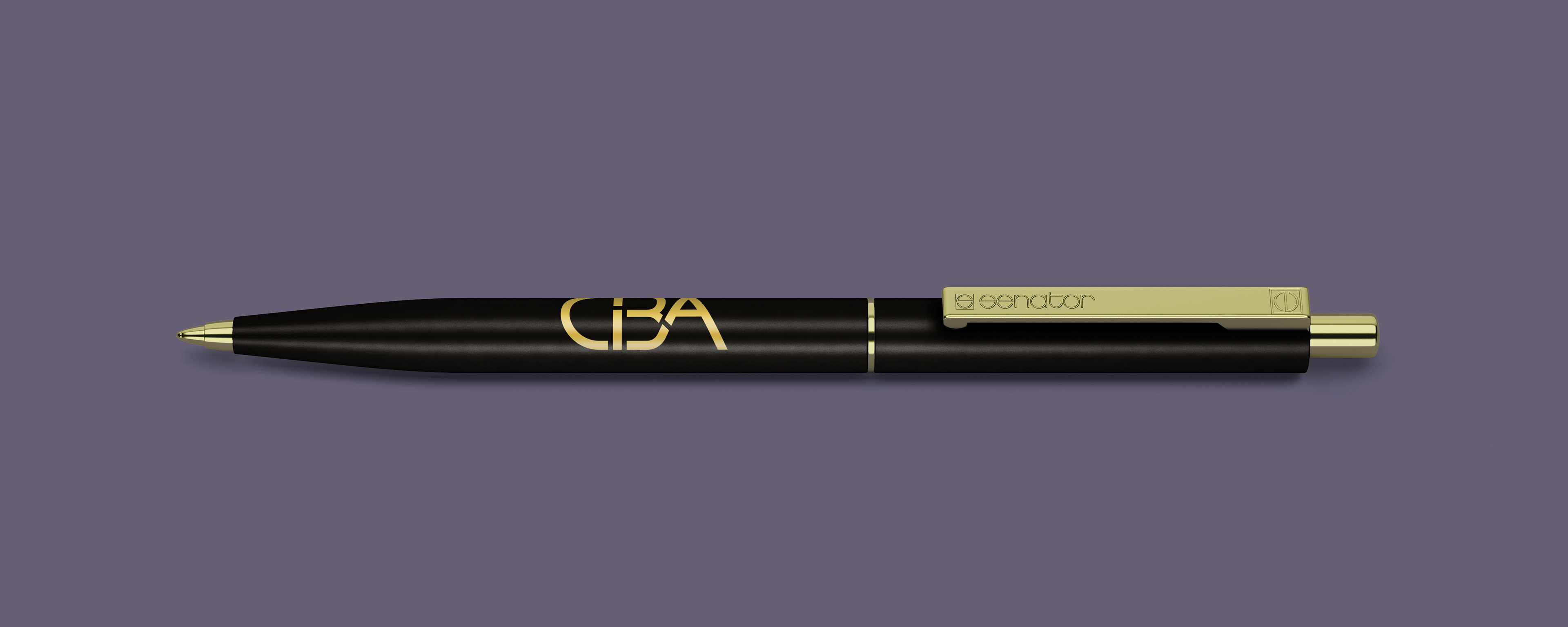
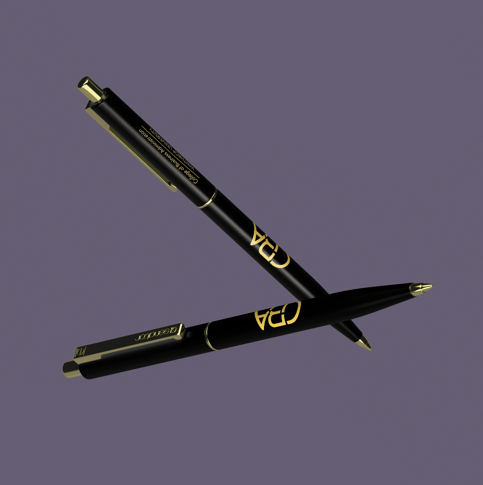
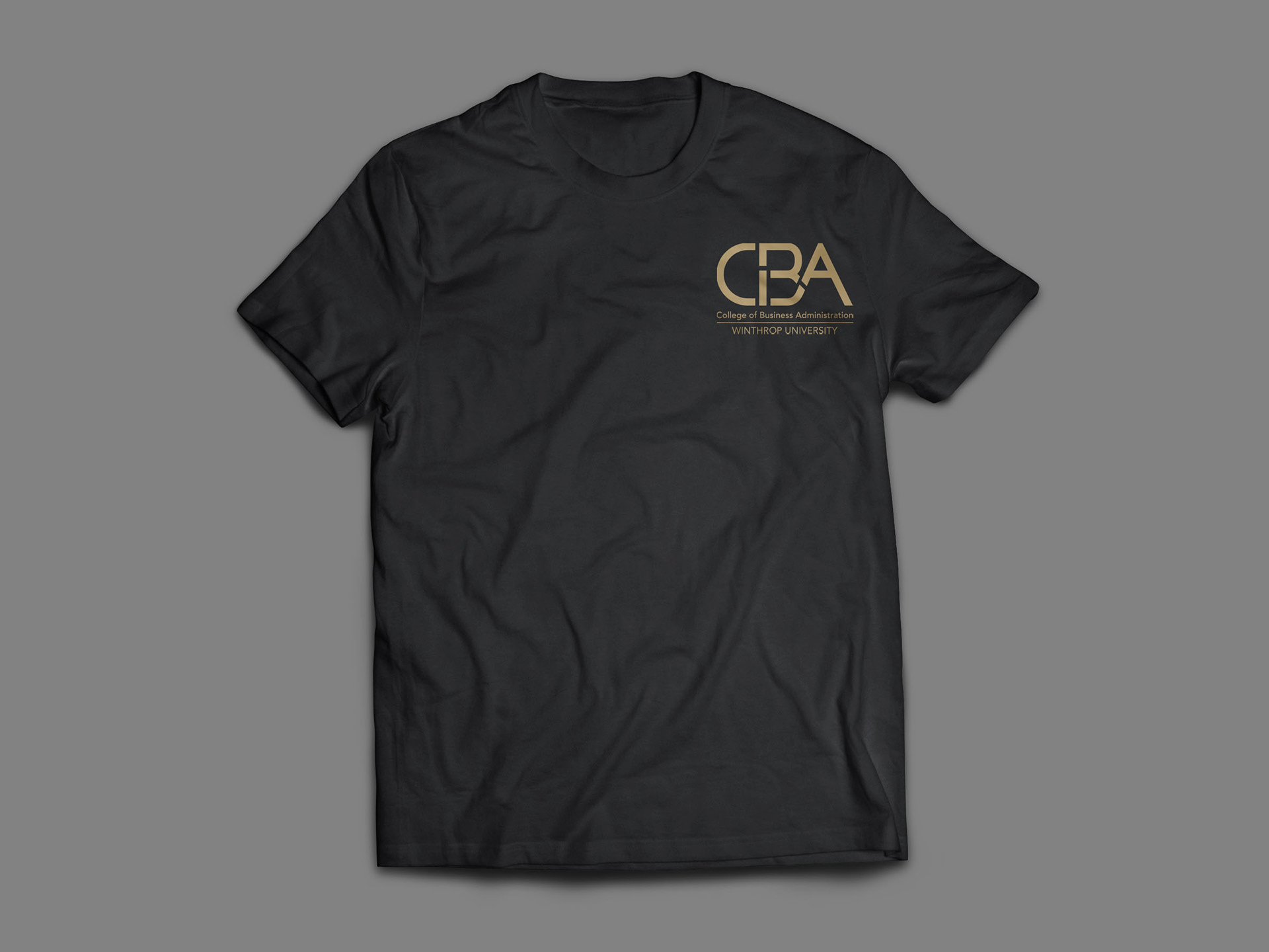
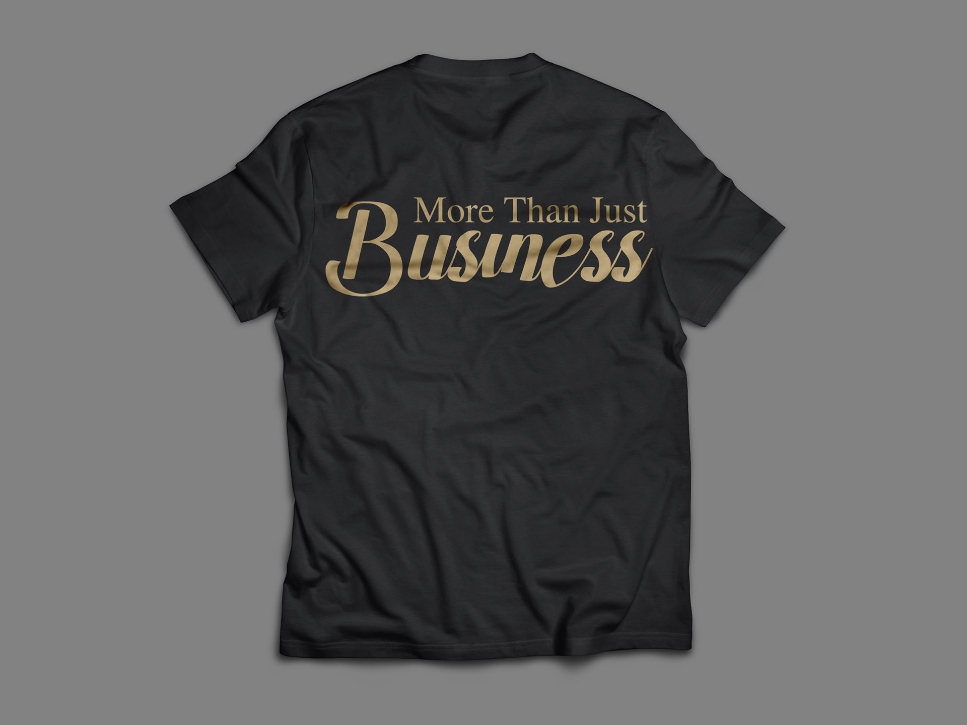
Touchpoints